
Purdue Spring 2026 | Adobe Dimension | Illustrator | Photoshop | Adobe Firefly
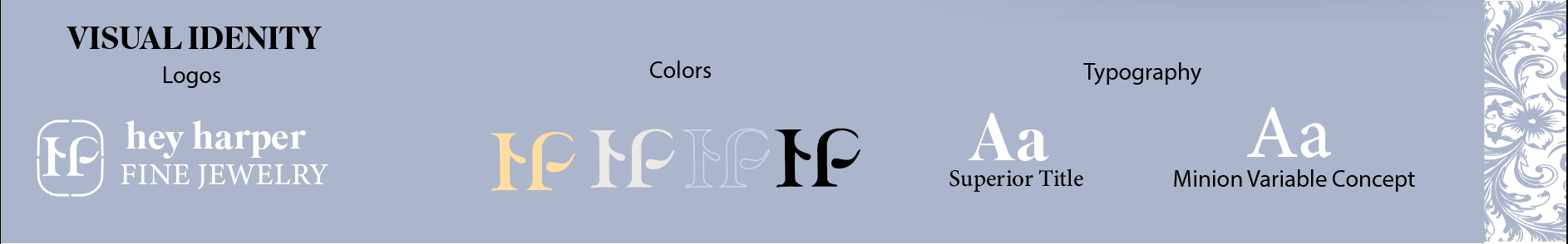
I rebranded Hey Harper’s packaging and logo to create a more modern and cohesive identity. The focus was on refining typography, color, and overall visual consistency across platforms, while also introducing reusable packaging to extend the product’s life beyond its initial use.
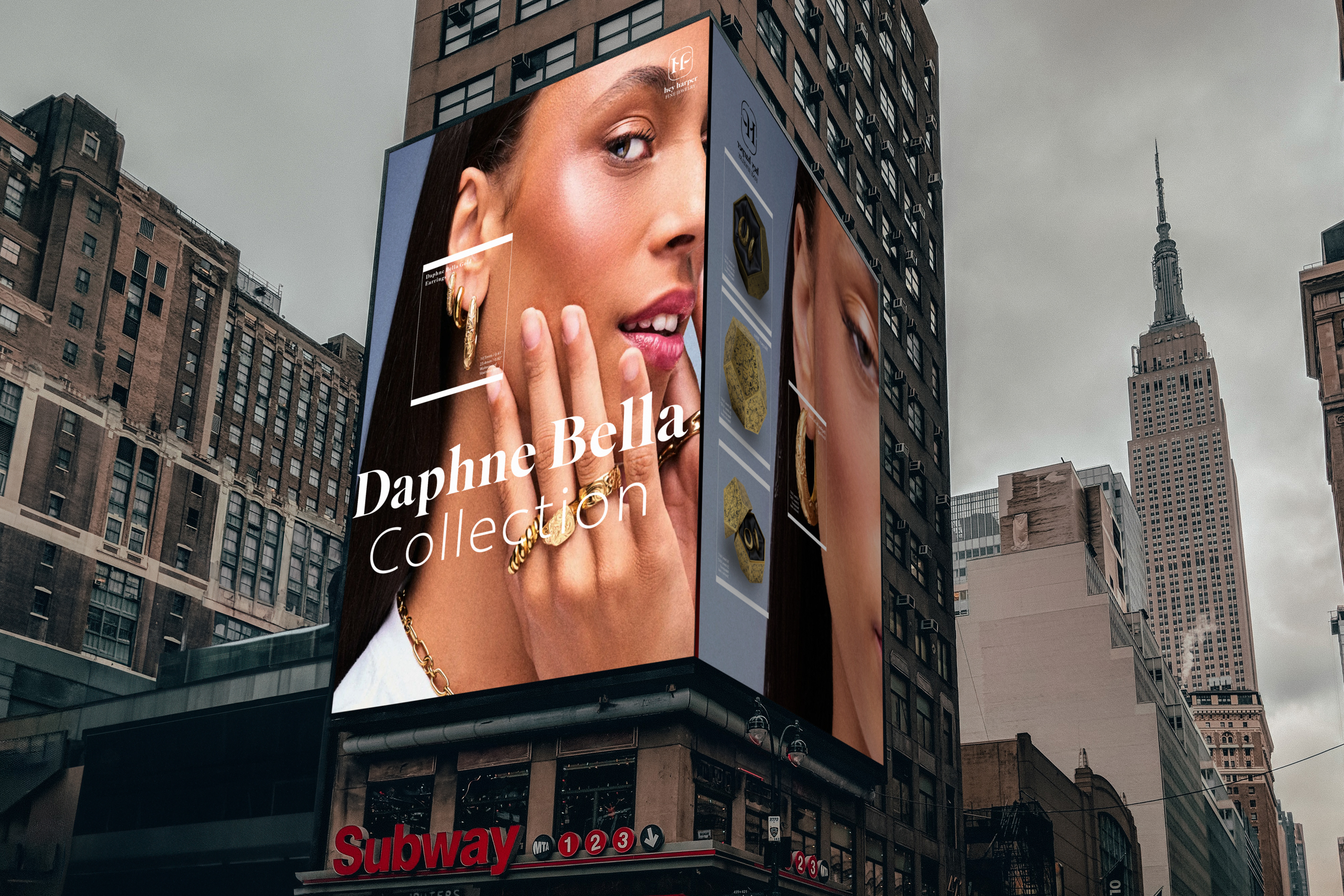
The billboard introduces the brand at scale, using clean visuals and bold typography to stand out in a fast-paced environment.
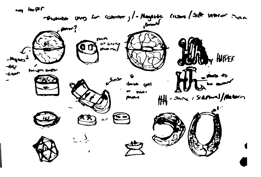
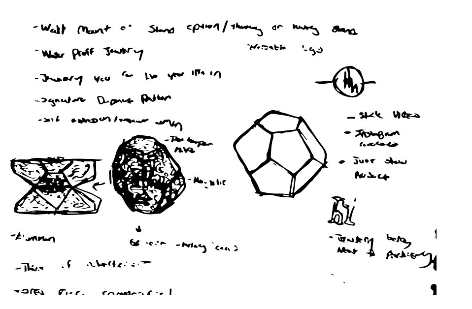
Early sketches explore logo ideas, type, and layout, leading to a refined and balanced identity.
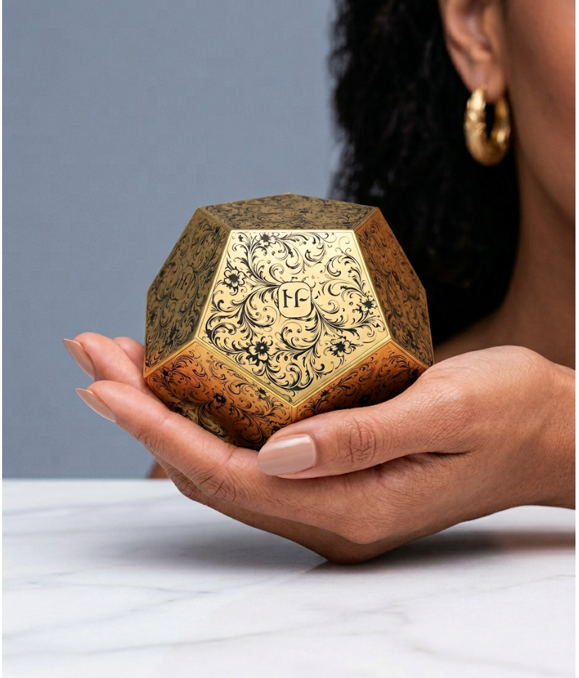
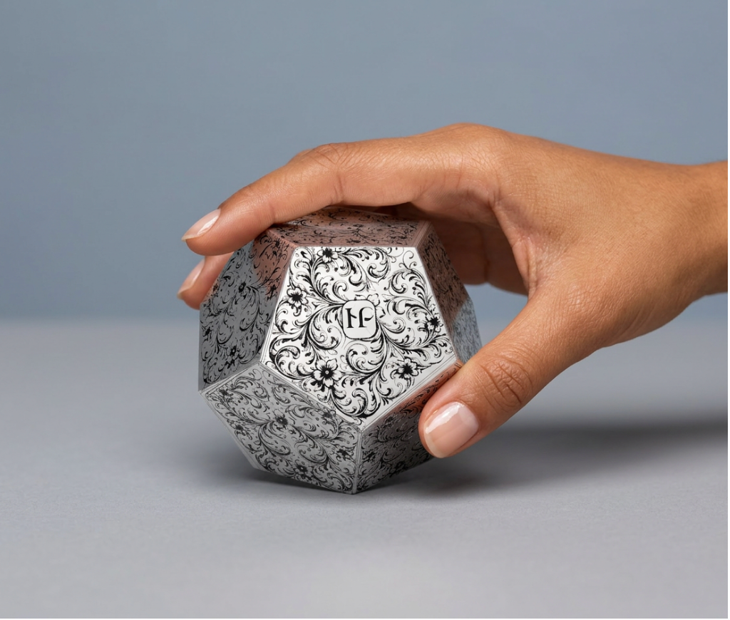
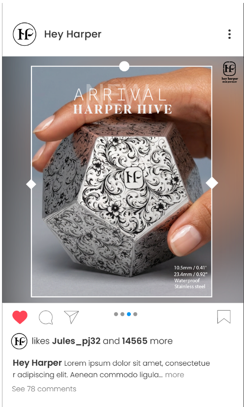
Packaging and product visuals emphasize a clean, minimal look that enhances the jewelry without overpowering it.
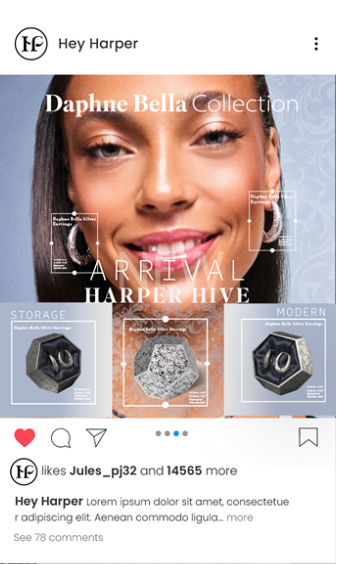
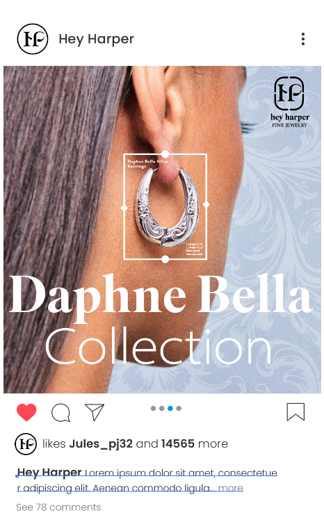
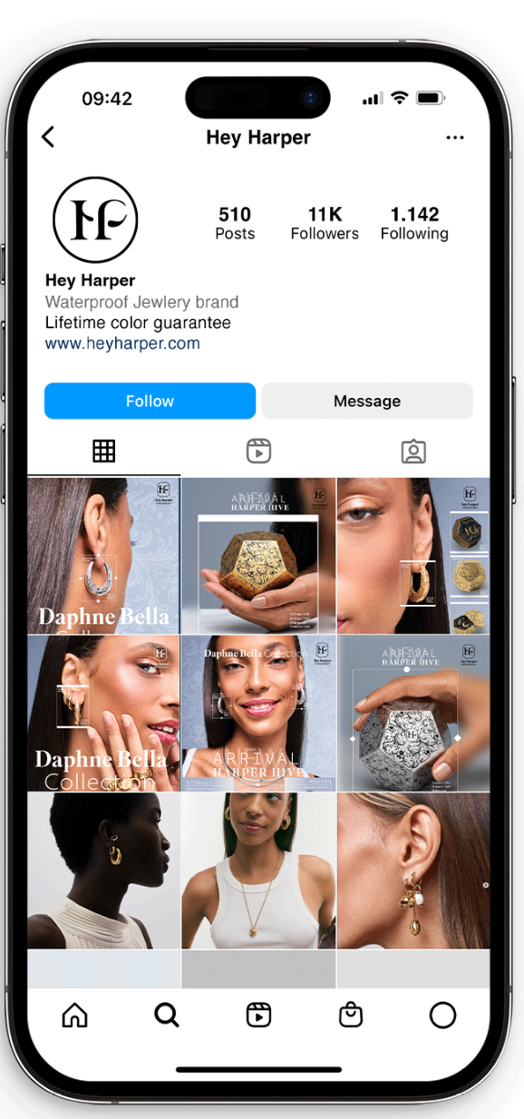
These designs extend the brand into digital spaces with a consistent and recognizable visual system.
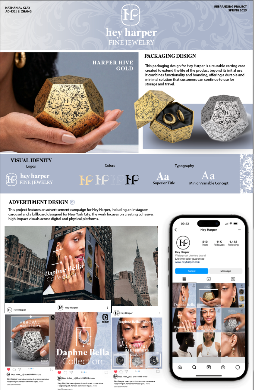
The final poster brings all elements together, showing how the identity works across multiple applications.